LESSON
15 – THE WEB DESIGN PROCESS
Steps to Building a Website
1 –
Decide your website’s topic.
In this stage, a web designer decides on the purpose
of the site. A web design company would
get this from its clients.
The website’s homepage should clearly explain the topic. The purpose of the website should immediately
be clear.
2 – Brainstorm your sub-topics
Along with your client, you need to make a list of
all the sub-topics that need to be covered on the site. Each sub-topic will likely get its own button
in the navigation bar.
This is a very important process. If you forget a topic, it might be difficult
to go back and add a button to your interface.
Often, one sees a website with several different menu systems because
the initial site design hadn’t accounted for all of the required buttons.
|
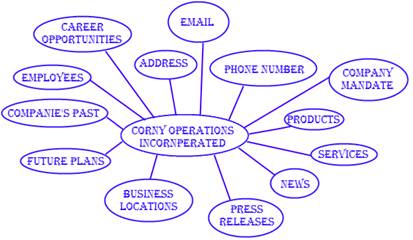
Here is an example of an
initial brainstorming bubble diagram. (STEP 2) |
|
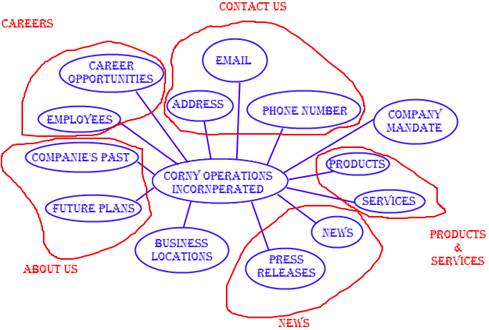
Grouping of similar items
should occur. What is
left is your different pages. (STEP 3)
|
3 –
Divide your website into logical sections.
It is important that you organize your
material. This involves deciding the
different sections that will appear on your site. If your site is big enough, you need to
organize subsections as well.
Example: When the
website http://tsn.ca was created, the site was
organized by sports. There was a section
created for NHL, NFL, NBA, Soccer, … And then, each of these sections had
their own subsections (such as Standings, Scores, Players, …)
4 – Decide
on a feel for the site.
Should the site give off a sense of professionalism,
or friendliness, or perhaps quality? Now that major sections are known for the site,
it is time to decide how the look should feel.
5 –
Develop a site navigation system.
At this point, you want to decide how visitors will
go through your site. The obvious need
is a menu. You need to decide how to
organize the menu and where to place it.
You have many tools that you can use:
·
Frames,
·
Tables
·
Image maps
·
Image slicing
·
CSS
6 – Give your site an attractive look
All of the organization decisions should be
done. It is now time to consider the
look of the site. For most commercial
websites, this look remains the same throughout all pages so that the user
knows he/she is still on the site.
Consistency is important. If you are using cartoon graphics on the site, you want to try to use only those types of cartoon graphics. This gives the site a professional look.
At this point, you are designing the look of your site including the navigation decisions you made in the previous step.
7 –
Create all the content pages.
Now that you have your look, you can start adding
the content to the pages. If well
planned, this is a very easy stage.
8 – Put
your site online.
Your website is complete. However, it only works on your computer. You need to transfer it to a web server that
will allow anybody on the internet to visit the site.
9 –
Maintain site (updates)
Unfortunately, very few websites can simply be
uploaded and forgotten. Constant
maintenance is usually needed. But hey,
from the perspective of the web designer, this can mean more pay!

