Tutorial 2 – Flaming Text
(PS Elements 1 by Mr. Dave Winsa)
(altered for PS Elements 5 by Mr. Campeau)
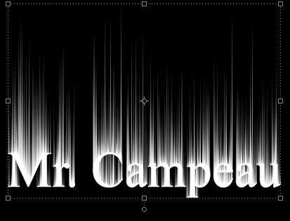
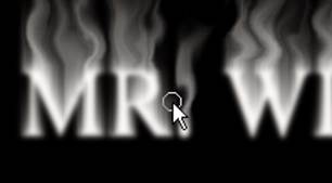
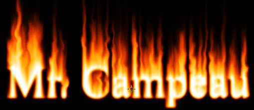
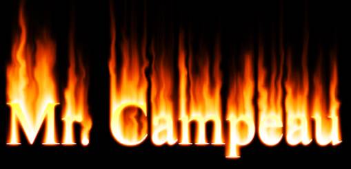
In this lesson, we will look at how to create the Flaming Effect around
text or even objects. It should look
something like the image below. You may
try to change things up a little if you wish.

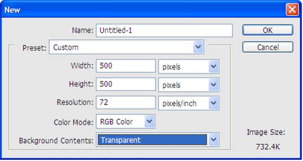
STEP 1
Open Photoshop
Elements 5. Create a new file that is
500 x 500 pixels in size.
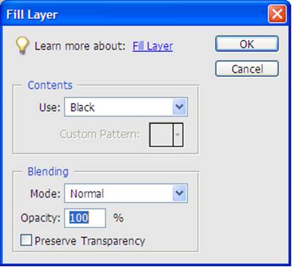
STEP 2
Use the fill
command (Edit > Fill Layer) to fill the background layer with black.
You could also use the Paint Bucket tool if you prefer.
STEP 3
Choose the text
tool and make sure the text colour is white.
Set the size of the text to 72 pt.
I would suggest using a font such as Times New Roman.
![]()
STEP 4
Type your name
on the canvas.

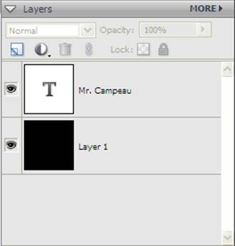
STEP 5
You should now
see a new Layer in the Layers panel for your name. If you don’t have the Layers panel open, open
it by using Windows > Layers
STEP 6
Use the move
tool to move the text to the center of the canvas. You don’t have to be perfectly centered.

STEP
7
Simplify the
text layer by right clicking on the layer (in the Layers panel) and choosing
Simplify Layer.
STEP 8
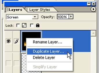
Next, you will
duplicate the layer containing your name.
To do this, right-click on the layer and choose duplicate layer. At the prompt, choose OK.
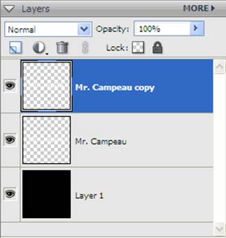
STEP 9
You should now
have 3 layers: the background, your name,
and your name copy in the layers palette. Make sure the layer your name copy is highlighted.
STEP 10
You now need to
rotate the top layer only. To do this,
you will simply drag the shown location on the image below. Note that this is really the Free Transform
tool that is in use.
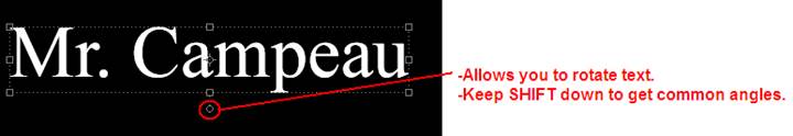
STEP 11
Rotate the text
so that it is completely vertical. Use
the SHIFT key to ensure that the angle is exact. Hit the green checkmark to confirm your
transformation (rotation).
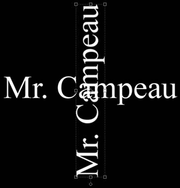
STEP 12
Make sure to
move the text so all of the text can be seen on the canvas. (Sometimes after rotation, the name goes off
the canvas.)
STEP 13
Unselect
anything that you have selected by hitting CTRL-D.
Choose Filter
> Stylize > Wind. You should do this 3 times. Note that you might have to change the Wind
direction if you rotated your name the other way.
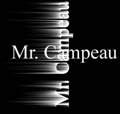
STEP 14
Select the top
layer (this should already be done).
Rotate it back to its original angle using the circle shown below.
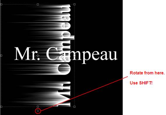
STEP 15
The names no
longer line up. Use the Move tool so
that the top layer is moved back to exactly where it was
originally. Note that you can use the
arrow tools to move the layer around slowly.
STEP 16
Use Filter >
Blur > Gaussian Blur to blur the wind lines a bit. Set the pixels to 2.0 and choose OK.
STEP 17
Choose the
middle layer in the layers palette and create a new
layer. It will appear between the two
layers with your name.
STEP 18
Fill the new
layer with black. You can use the Edit
> Fill Layer option to do this.
STEP 19
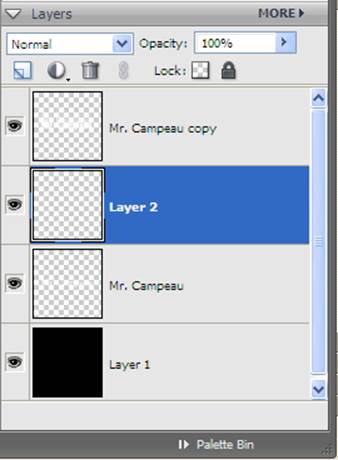
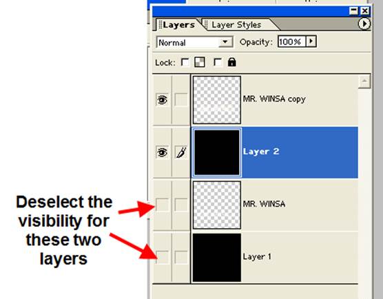
Notice the eyes
beside each layer. These indicate if the
layer is visible. If you click on the
eye for a layer, it will toggle between visible and invisible (invisible being
when there is no eye in the box).
Deselect all the other layers so that only the top two layers (the black
fill and the wind-modified text) have an eye beside them.
STEP 20
Choose Layer
> Merge Visible. This will merge the
two layers you have visible at the moment (the black background and the
wind-modified text) on to a new layer that you can work with.
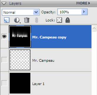
STEP 21
Next, we are
going to make the flames. Choose Filter
> Distort > Liquify.
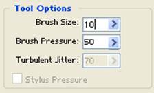
STEP 22
Choose a brush
size of 10 and make sure the pressure is 50.
Note that you might want a different brush size if you are using
different units. Simply pick a size that
is about one third of the width of a letter.
STEP 23
A) To make the
flames, you will take the brush and begin to drag from the top of the letters.
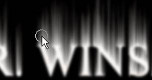
B) Drag
upwards, moving left and right as you are dragging up from the tops of the
letters. This will produce a flame
effect.
STEP 24
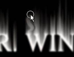
Once you have
done the tops of the letters, reduce the brush size and add ‘side’ flames. Add more detail to the flames without
distorting the text.
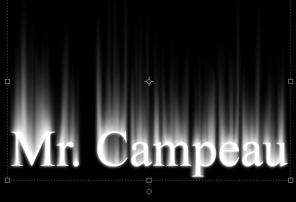
STEP 25
Once you are
satisfied, choose OK. You should have
something that resembles flames.
STEP 26
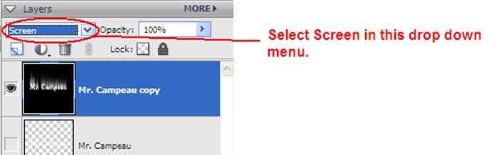
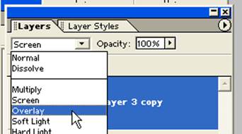
Switch the
layer we have just modified to screen mode.
STEP 27
Go to the
Hue/Saturation command (Enhance > Adjust Color > Adjust Hue/Saturation).
STEP 28
A) Check the
Colorize option.
B) Push up the
Saturation to 100.
C) Set the Hue
to about 40 so that the flames are a warm yellow. Note that you could choose a different colour
here if you wanted.
STEP 29
Duplicate the
yellow flame layer by right clicking and choosing duplicate layer.
STEP 30
A) Go back to
Enhance > Adjust Color > Adjust Hue/Saturation.
B) Make sure
Colorize is deselected.
C) Change the
Hue to -20. This will add orange to our
flames.
D) Choose OK.
STEP 31
Change the mode
of the layer to overlay. (This is done
on the drop down menu of the Layer panel.)
STEP 32
Drag the
original name text (the layer that is not wind-modified) to the top of the layers palette. To do
this, click and drag the layer up to the top of the layers
palette.
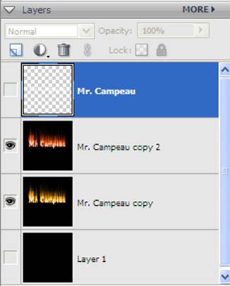
STEP 33
Make the top
layer visible again. (This could have
been done a while back really.)
STEP 34
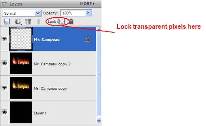
With the
untouched text layer selected, click the lock transparency check box. This will make sure any changes you make will
only affect the object on this layer (the text).
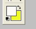
STEP 35
Change the
colours in the colour boxes at the bottom of the toolbar to white as the
foreground colour and yellow as the background colour.
STEP 36
Choose the
gradient tool from the toolbar and click and drag from the bottom of the text
to a little bit over the top of the text.
You will see a nice effect with the lettering.
That’s it! I hope you enjoyed it!
STUDENT RESULTS

Alex Astgen - 2009

Ruth Tindall - 2009
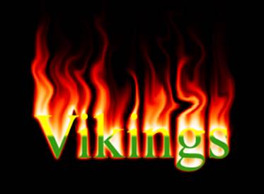
Billy Palecki - 2009
Did you try
changing the colours or using a different effect? Send me your results and some will be posted
below. Be sure to briefly explain what
you did differently.