Tutorial 14 – Fiery Rose
Found on the internet by
Justin Soulliere (2007)
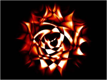
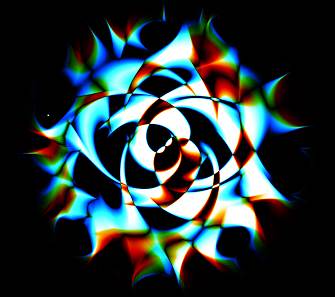
You will create something like
this:
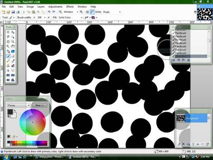
STEP 1
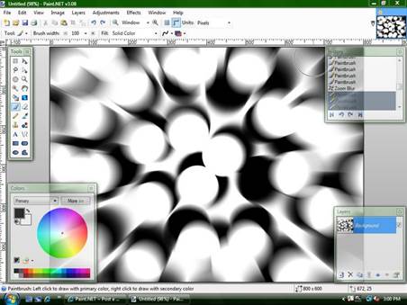
Start with a white back ground. Use the paint brush with a brush width of 100
to make many randomly placed black dots.
Note: Shanel
Petretti (2012) tried using three different colours
for the dots and got interesting results.
Try it if you dare! J
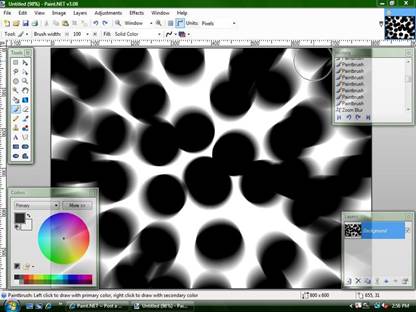
STEP 2
Then use a zoom blur. Set the Zoom Amount to 40.
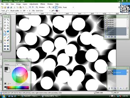
STEP 3
Then use the paint brush to make many
white dots, but don't cover all of the black dots, just enough to create
contrast.
STEP 4
Reapply the zoom blur again. Again use Zoom Amount equal to 40.
STEP 5
Apply zoom blur yet again. Again, use
zoom amount equal to 40.
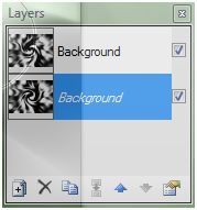
STEP 6
If you cannot see the Layers palette,
choose Window > Layers.
Duplicate the layer (Layers >
Duplicate Layer).
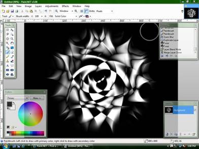
STEP 7
On one layer use the "twist"
effect with a twist amount of 20 and a quality of 5.
On the other layer do the same thing
only instead of 20 for the twist, do -20:
STEP 8
On the top layer set the blending mode
to "Difference". You can
access the Blending Mode by choosing Layers > Layer Properties. Be sure you have the top layer selected!
STEP
9
Flatten the image (Image > Flatten).
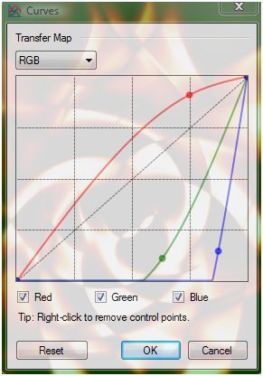
STEP 10
Go to Adjustments > Curves and adjust
the curve until you are happy with the result.
The adjustment made for this tutorial is
shown below but you can choose what you like best.
STEP 11 (Optional)
You can try to invert
the colours (Adjustments > Invert Colours) to see if you like that result
best.
Note: This optional
step is not part of the original tutorial.
STEP 12
You are done! Put your name in one of the corners.
|
This
tutorial was taken from the following url: http://paintdotnet.forumer.com/viewtopic.php?f=15&t=5883&st=0&sk=t&sd=a&hilit=rose+rose+fire+rose The
author’s name is unknown. The author’s
alias is Shuff. |
CREATIONS DONE BY STUDENTS
Mike Mainville
– 2008
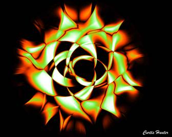
Curtis Hunter –
2010

Shanel Petretti – 2012
Using multi-colour dots (in Step 1) & Adjusments > Color Balance (at the very end).