|
HTML
WEB DESIGN

GUIDE – TABLES
III
- Create a new HTML document and
name it webpage5.html.
- Make sure the document only has
the HTML template in it.
|
<html>
<head>
</head>
<body>
</body>
</html>
|
SIDE-BY-SIDE
LAYOUT USING A TABLE
·
A
table can be used to place items in specific locations on the screen. We will use a table to place items side by
side on the screen.
First
we start with a table that shows two cells side by side.
|
<html>
<head>
</head>
<body>
<table border="1">
<tr>
<td></td>
<td></td>
</tr>
</table>
</body>
</html>
|
We now
place an image in the first cell. I
will use the same image that I used previously but feel free to go get
another image.
And we add a paragraph of text in the next cell beside it. Notice that this does make our code messy.
|
<html>
<head>
</head>
<body>
<table border="1">
<tr>
<td><img src="roy.jpg"></td>
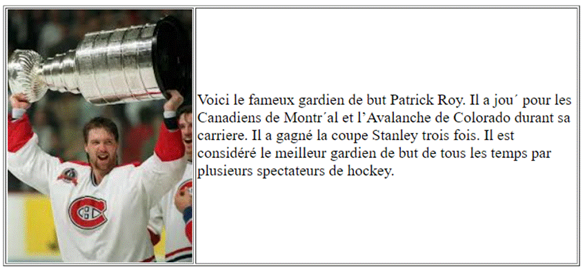
<td>Voici le fameux gardien de but Patrick Roy. Il a jou´
pour les Canadiens de Montr´al et l’Avalanche
de Colorado durant sa carriere. Il a gagné la coupe Stanley trois
fois. Il est considéré
le meilleur gardien de
but de tous les temps par plusieurs
spectateurs de hockey.</td>
</tr>
</table>
</body>
</html>
|
We can
do a quick preview to see what this looks like. Test your page.
o We immediately realized that the
window needs to be centered and we need a max width of about 600px.
|
<html>
<head>
</head>
<body>
<table border="1" align="center"
width="600">
<tr>
<td><img src="roy.jpg"></td>
<td>Voici le fameux gardien de but Patrick
Roy. Il a joué
pour les Canadiens de Montréal et l’Avalanche
de Colorado durant sa carriere. Il a gagné la coupe Stanley trois
fois. Il est considéré
le meilleur gardien de
but de tous les temps par plusieurs
spectateurs de hockey.</td>
</tr>
</table>
</body>
</html>
|
Here
is the look so far:
We can
make a few other changes to improve the look:
o Make the text larger.
o Make the photo a little smaller.
o Make the cell with the photo a little
wider than the photo, to give more space between photo and text.
o Remove the border around the table.
o I also opted to make the table 700px
wide instead.
|
<html>
<head>
</head>
<body>
<table
border="0"
align="center" width="700">
<tr>
<td width="180"><img src="roy.jpg" height="220"></td>
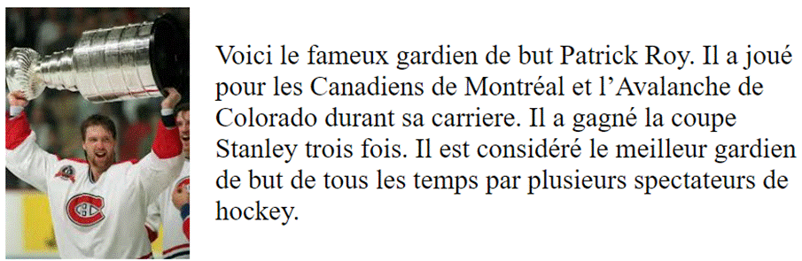
<td><font size="5">Voici le fameux gardien de but Patrick Roy. Il a joué
pour les Canadiens de Montréal et l’Avalanche
de Colorado durant sa carriere. Il a gagné la coupe Stanley trois
fois. Il est considéré
le meilleur gardien de
but de tous les temps par plusieurs
spectateurs de hockey.</font></td>
</tr>
</table>
</body>
</html>
|
And
this gives us the following which is a nice look.
GOT EXTRA
TIME?
·
Consider
adding another table underneath the one you just created with the paragraph
on the left side and the photo on the right this time.
Click here for an example with three tables.
|